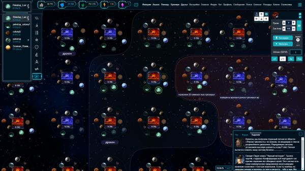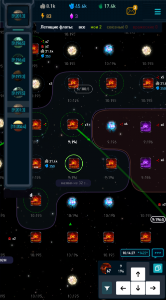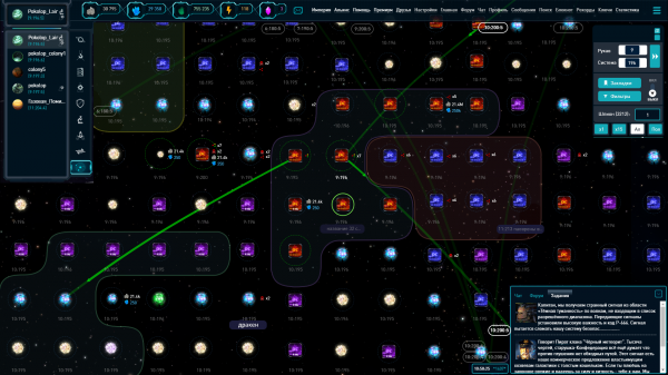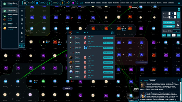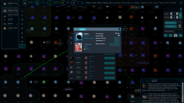
Interactive type of the galaxy
The main stages of work on a new galaxy look have been completed. Galaxy type can be changed to Interactive at interface settings page.
New galaxy look:
- is designed to make the space in the game seamless
- now you can navigate through the universe much nicer and faster
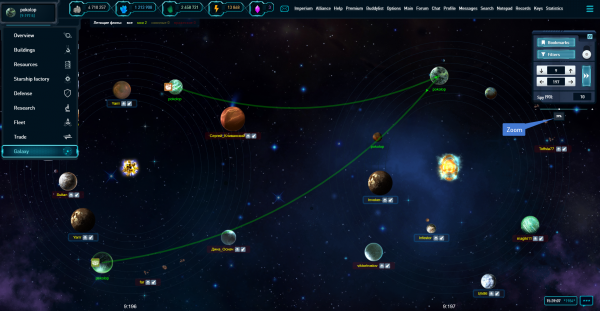
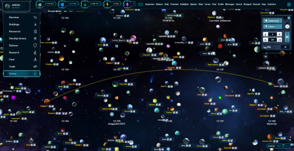
- you can look at neighboring systems on one screen just scrolling to the desired view. The mouse wheel will zoom the image
- to look for opponents, pirates and so on, became more comfortable and clearer due to better visibility + filters
- you can track the trajectory and the flight distances of fleets, simply by pulling the mouse along the flight path
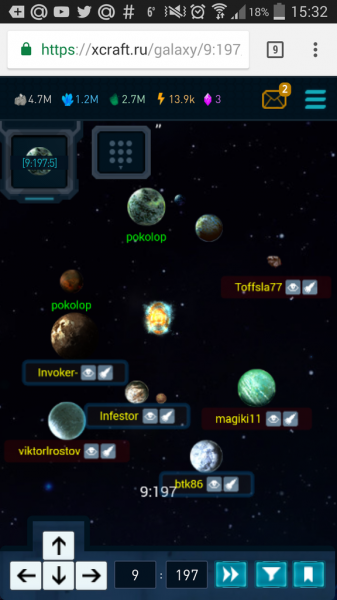
- in the mobile version, you can finally see your planets, the panel is placed in a convenient place. (See screenshots below)
Some changes:
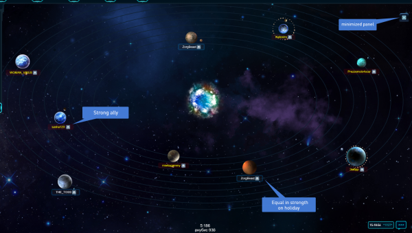
1. Now planets are scattered around the sun in orbits in order to edge of the System. As before the first planet in the system near the sun, the last in the last orbit in the system, not in a row, but randomly in a circle.
2. There are some changes in player's color illumination, while the overall color logic is maintained.
Previously, there was a bottom layer + nickname color. Now we have the bottom layer + the color of the nickname + the outline of the bottom layer. Such architecture allows to highlight all necessary information visually, without overlapping another. For example, when a player is on vacation mode or outside the law, it was not clear whether he was an enemy or an ally, etc. Now in new interface:
- The color of the nickname shows the relationship to the person (you / friend / ally / enemy)The bottom layer shows whether it can be attacked: green - weak / red - strong, and so on, as before
- The outline of the bottom layer shows that player, for example, in vacation mode.
All this will let you to get more information visually, which reduces the total time for making various decisions
3. The navigation bar can be minimized now.
Several screenshots of the current interactive galaxy:
And this is only the beginning! This galaxy is very flexible in development. We already have plans for its development. (! ATTENTION in the screenshots the prototype of the galaxy - the final result may have a slightly different look)
In the plans:
- the illumination of own planets by a round selection, and the illumination of planets when following the link
- various counters and visual metrics of distances from the current planet to the viewed planed
- political map of alliances
- one more level of zoom, which will allow to cover more systems. General interface may be changed for displaying objects on it, but it will be very convenient to study the space.
We will listen to your ideas with pleasure, the most interesting ideas will be considered for implementation. After all, we want to get the most convenient and useful map.
UPDATE:
Now you can put all your planets in a raw from 1 to 9, plz choose “Spiral sorting in interactive galaxy” in General Options
10 Апреля 2017 22:24:26
The scattering/disorder of the planets being displayed in the first few screen shots is.. chaotic in my opinion. While it may "look cool" i certainly do not think it would make usage easier/clearer/faster. Looks like it would have the opposite affect.
better seeing flight paths, more zoom options, seamless galaxy, these seem like nice features!
Filter requests
filter by player name
filter by specific point range (manual input high low)
filter object- station
filter by alliance name
better seeing flight paths, more zoom options, seamless galaxy, these seem like nice features!
Filter requests
filter by player name
filter by specific point range (manual input high low)
filter object- station
filter by alliance name
11 Апреля 2017 04:34:42
Информация
Вы не авторизованы
1 чел. читают эту тему (гостей: 1)
Пользователей: 0 Claude Bot


